

In the last few years, several of my favorite young adult novels have been republished with new editions featuring new book covers. This trend has been slowly expanding, so I thought I would do a side-by-side comparison of some of my favorite YA cover transformations. Most of these are from books that I’ve already read, but some are ones on my to-be-read pile. An * next to the “Original” or “New” denotes which edition’s cover is my favorite, and underneath I briefly explain why I prefer that one.
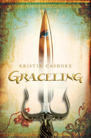
As much as I love the intricacies and featured character on the new cover, I prefer the simplicity and elegance of the original. I believe it better conveys the intense high fantasy setting of the novel, and the focal point of the eye on the dagger has a significance in the book.


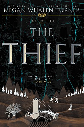
Hands down, this is my favorite of the two. Not only is the new cover more intricate, but everything on the cover directly relates to something in the book. The rune, boy, sword, and tarot cards are all significant, foreshadowing events in the novel before you even open the book.

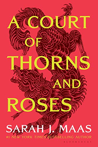
I’m partial to the original cover of the ACOTAR series because it features the narrator, Feyre, and the tattoo she gets during the novel. I also think the plants and thorns on this cover better convey the specific fantasy setting of the book and underline the importance of the novel’s title.


Although I love the original cover to this series, I prefer the illustration on the new one. It embodies the novel’s dystopian setting while still keeping the psi symbol that is so significant to the book.

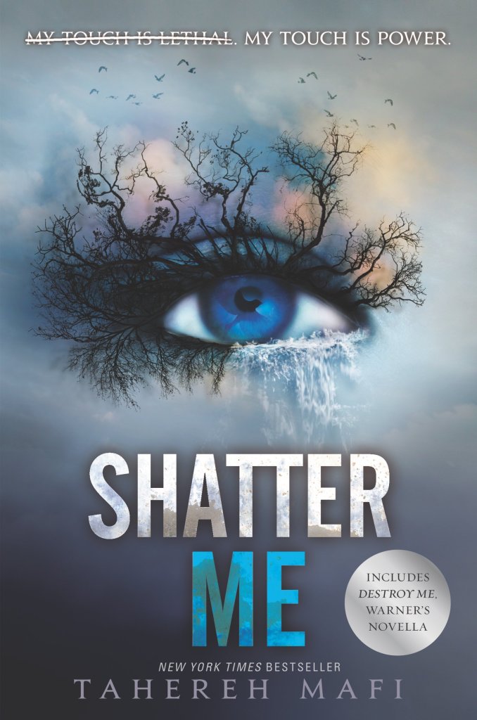
The new eye-themed cover of this book has always been my favorite because it invokes so much more emotion, at least in me, compared to the original. It also features the bird in her eye, a symbol which is extremely significant throughout the series. The eye motif is continued across each other book in the series, and since I’m a stickler for consistency, it makes me like this cover even more.

While I love the girl and wolf dynamic on the new cover, my favorite still has to be the original that was on my copy of “Shiver” when I first read the novel. The skeletal branches, faint wolf presence, and heart-shaped leaves are all significant in the book and evoke the slightly eerie feeling that the title conveys.


I like the newer cover better than the original because the girl on it more closely resembles Celaena, the novel’s protagonist, and it matches the covers of the other books in the series. I believe it does a better job of conveying the “deadly assassin” aspect of her character than the original, setting a more accurate tone for the book.

This cover is actually the reason why this book is on my TBR pile. I hadn’t heard of this novel before the new edition came out, but the complex cover detailing several different scenes instantly intrigued me. The new cover draws me in in a way the original one did not, and although I have not read it yet, I feel like it more accurately conveys the story.
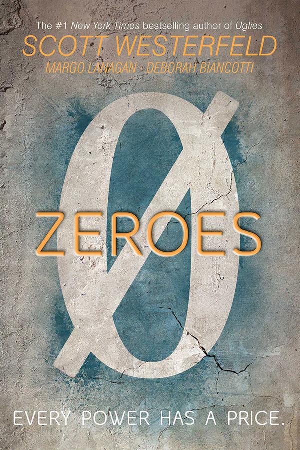

I like the new cover better because I prefer a book cover that instantly tells me something about the novel inside it. This cover builds onto the zero symbol of the original one, while also giving the reader a better understanding of the book’s setting and characters. It intrigues me more than the original cover and has me wanting to read the novel.
Do you agree with my favorite picks? Let me know which covers are your favorite by commenting below!
